
How to Choose Paint Color for Every Room
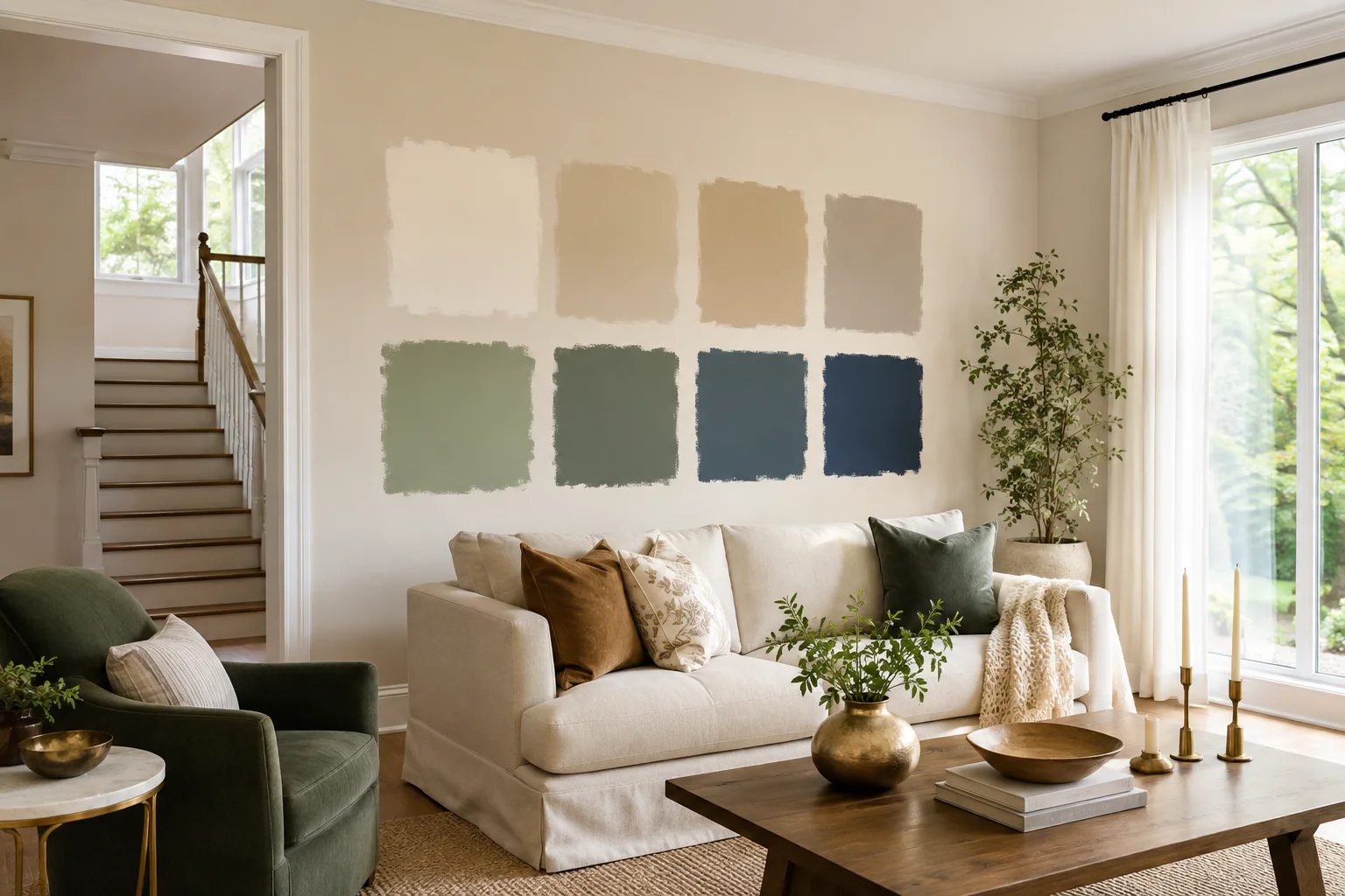
A paint chip can look perfect under store lighting and completely different once it covers a wall at home. Colour is affected by daylight, bulb temperature, surrounding finishes, room proportions, and even the colours visible through a doorway. That is why choosing paint well is less about finding a favourite swatch and more about testing a short list in the actual space. The most reliable approach starts with what cannot easily change, observes the room through a full day, and treats the ceiling, trim, and adjoining rooms as part of one composition. This guide gives you a practical room-by-room method for making those decisions with more confidence.
Start With the Fundamentals: What Actually Changes How a Color Looks
Natural light and room orientation
Natural light changes both in strength and colour throughout the day. A north-facing room generally receives cooler, more indirect light, which can make grey or blue undertones feel stronger. Warm whites may help balance that coolness, while already-cool colours can become more subdued. South-facing rooms tend to receive stronger, warmer light for longer periods. They can support a wider range of colours, but very warm beige or yellow-based tones may become more intense than expected.
East-facing spaces are brightest and warmest in the morning, then cooler later in the day. West-facing rooms behave in reverse: flatter light in the morning and warm, stronger light toward evening. In the GTA, long winters and a lower-angle sun can make these shifts especially noticeable. Trees, nearby buildings, window coverings, and snow reflection can also change what reaches the wall. Judge colour at the times when you will actually use the room, not only at noon on a bright day.
Artificial lighting
Once the sun goes down, bulb temperature takes over. Warm bulbs can pull cream, red, and yellow undertones forward. Cooler bulbs can make those same walls look cleaner or greyer while emphasizing blue and green undertones. Two rooms painted the same colour may feel unrelated if one uses warm lamps and the other uses cool overhead lighting.
Test samples with the lamps and fixtures you plan to keep. If a room mixes recessed lights, pendants, and table lamps, turn them on in the combinations you normally use. Consistent bulb temperature across connected rooms helps paint colours flow more naturally. If you plan to replace bulbs, do that before finalizing the paint rather than trying to correct the lighting with a different wall colour.
Room size and ceiling height
Colour does not physically change a room's dimensions, but it changes how the boundaries are perceived. Pale colours with gentle contrast can make wall planes recede and keep a compact room visually open. Deeper colours can create intimacy, especially in a bedroom, den, or dining area. They can also work beautifully in small rooms when used intentionally rather than as a rule to avoid.
Ceiling height matters because it changes the proportion of colour in your field of view. A low ceiling with sharp contrast against dark walls can feel more defined; carrying a wall colour onto the ceiling can soften that boundary. In a tall room, a slightly deeper ceiling colour can make the volume feel more composed. Always evaluate the wall and ceiling together.
The 5-Step Method for Choosing a Color With Confidence
- Pull colours from permanent fixtures. Start with flooring, stone, tile, counters, large upholstery, and fixed wood finishes. Identify whether their undertones lean warm, cool, red, yellow, green, or grey. Your paint does not have to match them, but it should relate to them. A warm oak floor, for example, usually sits more comfortably beside a neutral with a compatible warmth than beside an icy grey.
- Shortlist two or three candidates in the same family. Comparing a dozen unrelated colours creates noise. Choose a family first, then compare a lighter, mid-tone, and slightly deeper option. Keeping the undertone consistent makes differences in value and saturation easier to judge.
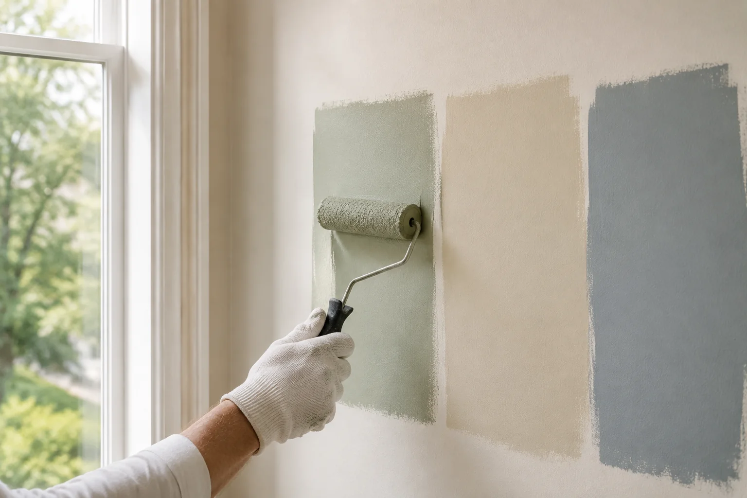
- Test large swatches. Tiny chips do not show how colour behaves across a wall. Paint at least a 12-by-12-inch sample, ideally larger, using two coats so the existing wall colour does not distort the result. Put samples on more than one wall because the window wall and the wall opposite it receive very different light. Removable sample boards are helpful, but a wall sample reveals the effect of the actual surface texture.
- Live with the samples for 24 to 48 hours. Look in morning light, afternoon light, on an overcast day if possible, and under artificial lighting at night. Note when a colour looks best and when an undertone becomes distracting. The right choice should remain acceptable through the room's normal range, not only during one perfect hour.
- Check adjoining rooms before committing. Stand in hallways and doorways. In an open-concept home, several wall colours may be visible at once. Place the candidate beside the colour in the next room, the shared trim, and the flooring that connects the spaces. A palette can vary while still sharing one or two visual anchors.
Choosing Paint Colors Room by Room
Living and family room
Living spaces need to work with the most visible finishes in the home: flooring, rugs, sofas, window coverings, artwork, and often an adjoining kitchen. Warm neutrals are flexible because they can bridge wood tones and soft furnishings without becoming the main event. Look for an undertone that repeats something already present, such as a warm stone fireplace or a muted green textile.
Soft greens can make a family room feel grounded and calm, especially where windows look toward trees. Muted blue or blue-grey families suit rooms with cooler stone, black accents, or strong daylight. Deeper olive, charcoal, or blue can work on all walls in a den-like room or on one clearly defined architectural plane. Avoid choosing an accent wall simply because it is empty; use it to reinforce a fireplace, built-in feature, or natural focal point.
Kitchen
Kitchen wall colour should respond to cabinets, counters, backsplash, flooring, and metal finishes. Put the paint sample directly beside each fixed surface. A white that looks neutral alone may turn yellow beside a cool counter or blue beside warm cabinetry. Warm whites, restrained greiges, and soft mineral greens often provide enough contrast to frame the fixed finishes without competing with them.
Because kitchens contain many hard surfaces, colour can feel stronger than it does in a furnished bedroom. Test around upper cabinets and on the wall receiving the most daylight. If the kitchen opens to a living area, a related neutral can connect the spaces while a subtle shift in depth gives each zone its own identity.
Bedrooms
Bedrooms support more personal colour choices because they are usually separated from the main sightlines of the home. Soft green, muted blue, clay-neutral, and warm off-white families can all create a restful background. The key is controlling saturation: colours that look gentle on a sample may feel much stronger across four walls.
Consider bedding and window coverings under both daylight and bedside lamps. A deep blue or pine-toned wall can create a calm, enveloping effect when the trim and ceiling stay quiet. In a small bedroom, a pale colour is not mandatory; consistent colour with low contrast can sometimes make the edges feel less busy than alternating light and dark surfaces.
Bathrooms
Bathrooms often have limited daylight and several reflective surfaces. Tile, counters, mirrors, and bright fixtures can amplify undertones. Hold samples beside the tile rather than choosing from memory. Clean warm whites work well where tile is creamy, while cooler off-whites can suit crisp white porcelain and grey stone. Soft green-blue families can feel fresh, but test them under the actual vanity lighting because cool LEDs can push them noticeably bluer.
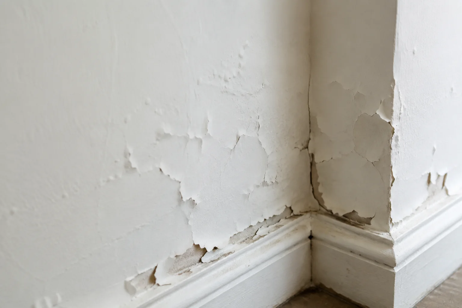
Condition matters as much as colour in a bathroom. Address peeling paint, moisture staining, failed caulk, or soft drywall before repainting. Choose a finish designed to tolerate regular cleaning and humidity, and allow adequate drying and ventilation.
Home office
An office colour should support the kind of focus the room needs. Warm neutrals reduce visual distraction and work with changing screen light. Muted greens can feel settled without becoming dull. Deep blue or charcoal may work behind a desk or video-call background if there is enough light on the face. Check how the wall reads on camera as well as in person; automatic camera exposure can make very light walls glare and dark walls appear flat.
Hallways and stairwells
Hallways link the whole palette, so continuity usually matters more than drama. A versatile off-white, soft greige, or light warm neutral can connect rooms with different colours. Samples must be tested in the darkest section, not only near the front door. Artificial lighting and shadows from railings can emphasize green, violet, or yellow undertones.
Stairwells also involve tall walls, difficult access, and strong sightlines between floors. A subtle colour often performs better across that large uninterrupted surface, but deeper tones can work when the architecture supports them. Consider scuff resistance and sheen because these spaces receive frequent contact.
Don't Forget the Ceiling and Trim
Why ceiling color is part of the plan
The ceiling is the fifth wall. Flat white remains a dependable choice because it limits reflection and keeps attention on the room below, but it is not the only option. A softened white related to the wall colour can feel more integrated than a sharp, cool white. Carrying a pale wall colour onto the ceiling reduces contrast and can make a compact room feel calm. A deeper or contrasting ceiling can create character in a dining room or bedroom, provided the lighting and proportions support it.
How ceiling condition affects the finished look
Fresh paint does not hide texture, uneven patches, water stains, or old repairs. In fact, new colour and changing light can make those conditions more visible. Water staining should be traced to its source before cosmetic work begins. Cracks and nail pops need proper preparation, and patched areas may need primer so they do not flash through the finish.
If the surface is textured or has an older popcorn finish, the scope may involve more than painting. Gold Painter provides professional ceiling painting and popcorn ceiling removal. You can also estimate ceiling or drywall repair costs before painting to understand how surface preparation may affect the plan.
Trim, doors, and baseboards
Using one consistent white or off-white for trim, doors, and baseboards gives different room colours a common frame. Match the trim undertone to the walls and fixed finishes. A creamy trim can look dingy beside a crisp blue-white wall, while a stark white may feel disconnected from warm flooring and stone.
Trim usually benefits from a more washable finish than walls. The slight sheen also defines edges and highlights clean lines. Before selecting the final colour, compare wall samples directly against the existing trim. If the trim will be repainted, test both colours together rather than treating them as separate decisions.
Matching Paint Sheen to Each Room
Sheen affects cleanability, light reflection, and how clearly surface imperfections show. Product terminology varies, so compare the actual sheen level rather than relying only on the label.
| Room or surface | Recommended sheen | Why |
|---|---|---|
| Living rooms and bedrooms | Eggshell or satin | Offers a balanced appearance with moderate washability for everyday walls. |
| Kitchens and bathrooms | Satin or semi-gloss | Handles cleaning and moisture better, provided the surface is prepared properly. |
| Trim and doors | Semi-gloss | Creates a durable, washable finish and defines detailed edges. |
| Ceilings | Flat or matte | Limits glare and helps reduce the visibility of minor surface variation. |
Higher sheen reflects more light and tends to reveal dents, sanding marks, and patch edges. A durable finish cannot compensate for poor preparation. In kitchens and bathrooms, choose a product intended for the conditions and follow its cure-time guidance before heavy cleaning.
Creating Color Flow Between Rooms
A connected home does not need the same wall colour everywhere. It needs a clear relationship between colours. Start with a shared anchor, usually the trim and ceiling colour. Then limit the main whole-home palette to two or three core colours, with smaller accent colours reserved for enclosed rooms or defined features.
Plan from the longest sightlines. Stand at the front entry, at the base of the stairs, and in the main open-concept area. Note which rooms are visible together. Colours with a related undertone can change in depth without clashing. For example, a warm off-white in the hall, a muted clay-neutral in the living room, and a quiet green in an adjacent office can feel cohesive when the trim and fixed materials connect them.
Repeat colours deliberately. A wall colour from one room might reappear in textiles or artwork in the next. Avoid alternating unrelated statement colours from room to room; the effect can make the home feel visually segmented. A smaller palette also simplifies future touch-ups and maintenance.
Pay attention to transition points. If two colours meet at an open archway with no clear corner, decide where the cut line will land before buying paint. In some layouts, carrying one neutral through the connecting hall produces a cleaner result than forcing a change at an arbitrary edge. Sample boards can be moved from room to room to compare the palette, but confirm the finalist directly on each differently lit wall. A colour that connects a bright kitchen and shaded hallway must remain balanced in both.
Common Paint Color Mistakes to Avoid
- Skipping large swatch tests. A small chip cannot represent the scale, texture, and changing light of a full wall.
- Ignoring undertones. Compare candidates against flooring, tile, counters, fabrics, and trim instead of judging the colour alone.
- Painting before repairing walls or ceilings. Cracks, patches, stains, and damaged drywall remain visible through a new finish. Proper preparation is part of our interior painting services.
- Choosing under store lighting only. Bring samples home and view them under the room's daylight and lamps.
- Forgetting the finish. Sheen changes both the colour's appearance and how much surface variation you can see.
When to DIY and When to Call a Professional Painter
A small single-room refresh can be a reasonable DIY project when the walls are sound, access is easy, and you have time for preparation. Sample testing, filling a few nail holes, careful cutting, and two even coats are manageable for many homeowners. Keep enough labelled paint for future touch-ups and allow the full recommended dry time.
Professional help becomes more valuable when several rooms must coordinate, ceilings are involved, walls are tall, or stairwells require special access. Older homes may also have recurring cracks, stained ceilings, damaged drywall, or wallpaper residue that needs repair before colour can look its best. Review our full range of interior painting and repair services when the project combines paint with ceiling or surface preparation.
Get Help Choosing the Right Color for Your Home
The best colour plan responds to your light, fixed finishes, room use, and the way spaces connect. Start with a focused shortlist, test generously, and give the samples enough time to reveal their undertones. If the project includes several rooms, difficult ceilings, or wall repairs, Gold Painter can help define the preparation and painting scope during an on-site visit. Explore our interior painting services or request a free estimate for your Richmond Hill or GTA home.
Bring photos or samples of the flooring, tile, furniture, and fabrics that will remain. Those references make the conversation more useful and help keep the final palette connected to the home you already have.
Keep your final sample boards until the work is complete. They provide a consistent reference when checking adjacent rooms, trim, ceilings, and lighting changes before the selected colours cover the walls.
Have a project in mind?
Let's see what your space needs.
Arrange a free on-site visit and we'll talk through your project.